5 Psychological Factors Behind Great Web Design


With so many websites competing for attention, great web design goes beyond aesthetics or functionality. Truly compelling design taps into something deeper: human psychology. At its core, the best designs are built on a deep understanding of how people think and behave. This allows designers to create experiences that resonate on a personal level, subtly guiding users' actions and decisions in ways that feel natural and intuitive.
The influence of psychology in web design is powerful. By applying key psychological principles, designers can craft more engaging and persuasive websites that align with users' unconscious desires and behaviors. This results in better user experiences, higher conversion rates, and stronger customer loyalty.
We’ll explore 5 key psychological factors—Color Psychology, Hick’s Law, Fitts’s Law, the Principle of Proximity, and Emotional Design—and how they shape user interactions. By mastering these principles, designers can create digital experiences that captivate and convert, turning casual visitors into loyal customers.
Factor 1) Color Psychology

The role of color in human perception is both profound and nuanced, making color psychology a cornerstone in the realm of web design. This branch of psychology focuses on how colors affect our feelings, behaviors, and decision-making processes. In the digital domain, the strategic use of color can evoke specific emotions, convey messages, and influence user actions, making it a powerful tool for designers aiming to create impactful user experiences.
Understanding Color Psychology
Color psychology is grounded in the idea that different colors can trigger various psychological responses. These responses are influenced by cultural contexts, personal experiences, and innate preferences, making the effect of color on individuals both universal and highly personal. For instance, while red is commonly associated with passion, excitement, and urgency across many cultures, it can also signify danger or stop in certain contexts.
Colors and Their Psychological Impacts
- Red: Known for its ability to grab attention, red is often used to highlight calls to action, stimulate appetite, or indicate urgency. However, it should be used sparingly to avoid overwhelming users.
- Blue: Associated with trust, calmness, and professionalism, blue is favored by financial institutions and healthcare websites to create a sense of security and reliability.
- Green: Symbolizing nature, growth, and harmony, green is used to promote eco-friendly products or denote financial prosperity and stability.
- Yellow: Evoking feelings of happiness, optimism, and caution, yellow can be used to draw attention and create a sense of warmth and energy.
- Purple: Conveying luxury, creativity, and mystery, purple is often used in beauty or luxury product websites to evoke a sense of sophistication.

Applying Color Psychology in Web Design
The application of color psychology in web design extends beyond choosing the right colors for a brand’s identity. It involves understanding the target audience, the message the website intends to convey, and the emotions it aims to evoke. Here are some tips for applying color psychology effectively:
- Know Your Audience: Different demographics may react differently to colors. Consider the cultural, gender, and age preferences of your target audience when selecting colors.
- Use Color Contrasts to Enhance Usability: High contrast between text and background can improve readability and focus attention where it’s needed most.
- Employ Color to Guide User Actions: Utilize color to highlight key actions you want users to take, such as filling out a form or clicking a button.
- Create the Right Atmosphere: Choose a color palette that reflects the mood you want to set for your website. For example, use soft, neutral colors for a relaxing user experience or bright, vibrant colors to energize and engage.
Color and Branding
The colors chosen for a website also play a critical role in branding. Consistent use of a brand’s colors across all digital platforms helps to reinforce brand identity and creates brand recognition. This consistency helps build trust and credibility with users, enhancing their overall perception of the brand.
The Psychological Nuance of Color
It’s important to note that while color psychology provides valuable insights, the emotional impact of color is not one-size-fits-all. The context in which colors are used, combined with individual user experiences, can significantly influence their effect. Therefore, web designers should employ color psychology as a guide rather than a strict rulebook, always considering the broader context of their design choices.
Color psychology is an essential element of effective web design. By thoughtfully applying color principles, designers can craft visually appealing websites that resonate emotionally with users, guiding their behaviors and decisions in subtle yet powerful ways. As we continue to explore the psychological factors behind great web design, the influence of these color choices underscores the deep interconnection between visual aesthetics and user psychology.
Factor 2) Hick’s Law
Hick’s Law, a principle often applied in user interface design, revolves around the idea that the time it takes for a person to make a decision increases with the number and complexity of choices. Named after British psychologist William Edmund Hick, this law suggests that too many options can overwhelm users, leading to indecision or frustration. In the world of web design, understanding and applying Hick’s Law can significantly improve user experience by streamlining navigation and simplifying choices.
The Essence of Hick’s Law
At its core, Hick’s Law highlights a fundamental aspect of human cognitive processing: the relationship between choice and decision-making time. The more options presented, the longer it takes for the brain to process these options and make a decision. This principle has profound implications for web design, where the goal is often to guide users toward a desired action or outcome efficiently.
Application in Web Design
Implementing Hick’s Law in web design involves minimizing the cognitive load on users by reducing the number of choices to those most relevant or important. Here are several strategies for applying Hick’s Law effectively:
- Simplified Navigation: Create a clear, hierarchical navigation structure that limits the number of menu items and categorizes options logically. This approach helps users find information more quickly, enhancing their overall experience.
- Focused Content and Features: Prioritize content and features based on user needs and business objectives. By presenting only the most critical elements, you reduce decision fatigue and guide users more directly toward taking action.
- Streamlined Processes: Whether it’s making a purchase, signing up for a newsletter, or filling out a contact form, simplifying these processes can reduce user hesitation and increase conversions. Limit the steps and choices involved in each task to the essentials.
Hick’s Law in Action: Case Studies
Several successful websites and applications have applied Hick’s Law to great effect. For example, a leading e-commerce platform redesigned its checkout process by reducing the number of steps and choices involved, leading to a significant increase in conversion rates. Similarly, a popular social media app simplified its interface by focusing on core functionalities, resulting in enhanced user engagement and satisfaction.
Balancing Choice and Simplicity
While simplifying choices is beneficial, it’s important to strike a balance. Over-simplification can lead to a lack of control or freedom for the user, potentially diminishing the user experience. The key is to provide enough options to empower users without overwhelming them. This balance will vary depending on the context of the website and its audience.

Designing with Hick’s Law in Mind
When designing with Hick’s Law in mind, consider the following steps:
- Conduct User Research: Understand your audience’s needs and preferences to identify which choices are most relevant and valuable to them.
- Prioritize Content and Features: Evaluate the importance of each element on your website. Focus on delivering a streamlined experience that guides users to your most important content or actions.
- Test and Iterate: Use A/B testing and user feedback to refine the number and presentation of choices on your website. Continuous testing can help identify the optimal balance for your specific audience.

Hick’s Law is a powerful principle in the psychology of web design, emphasizing the importance of simplifying choices to enhance user decision-making. By applying this law, designers can create more intuitive, efficient, and user-friendly websites. As we navigate the complexities of digital design, understanding the psychological underpinnings of user behavior remains a critical tool for creating compelling online experiences.
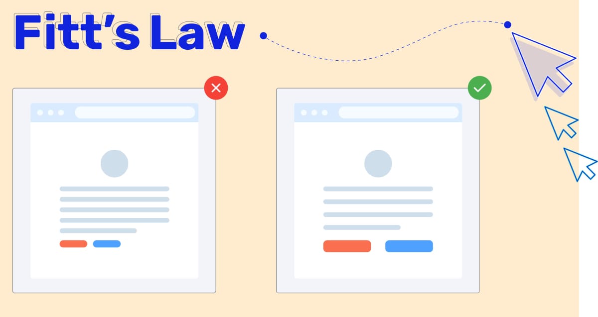
Factor 3) Fitts’s Law
Fitts’s Law is a predictive model of human movement primarily applied in the design and evaluation of user interfaces. It posits that the time required to rapidly move to a target area is a function of the ratio between the distance to the target and the width of the target. In essence, the closer and larger a target, the faster it is for users to move to it. This principle, established by psychologist Paul Fitts in 1954, has profound implications for web design, especially in creating user-friendly navigation and interactive elements.
Understanding Fitts’s Law
The principle behind Fitts’s Law can be boiled down to two main factors: the distance to the target and the size of the target. According to the law, decreasing the distance to a target or increasing its size can reduce the time it takes for users to interact with it. This is why buttons or links that are crucial for navigation or call-to-action (CTA) functions are often made larger and placed in easy-to-reach locations on web pages.
Application in Web Design
Applying Fitts’s Law in web design involves optimizing the layout and elements of a webpage to reduce effort and increase efficiency for the user. Here are some practical applications:
- Strategic Placement of Interactive Elements: Placing important navigational buttons and links in areas where users can easily reach them, such as the top of the page or along the sides, can improve navigation speed and efficiency.
- Sizing Targets Appropriately: Making clickable targets like buttons and links large enough to be easily tapped or clicked reduces user error and frustration, particularly on mobile devices where finger precision is a factor.
- Minimizing Cursor Travel Distance: Designing layouts that minimize the distance the cursor must travel between tasks can enhance the user’s efficiency and satisfaction, especially for tasks that require frequent interaction.
Fitts’s Law in Action
A practical example of Fitts’s Law in action is the placement of the logout button in many web applications. Often, this button is placed far from frequently accessed elements to prevent accidental logouts, reflecting an understanding of the law’s implications for interface design. Similarly, many e-commerce sites make the shopping cart button large and place it in the upper right corner of the page, making it easy and fast for users to initiate the checkout process.
The Importance of Context
While Fitts’s Law provides valuable guidelines for interface design, it’s crucial to consider the context of its application. The law assumes that movement is linear and uninterrupted, which may not always be the case in complex web interfaces where users navigate through multiple layers of content. Additionally, visual cues and design aesthetics can also influence the effectiveness of target design beyond size and distance considerations.
Designing with Fitts’s Law in Mind
When incorporating Fitts’s Law into web design, consider the following best practices:
- Analyze User Flows: Understand the most common tasks users perform on your site and optimize the layout to facilitate these actions.
- Use Visual Hierarchy: Employ size, color, and contrast to make important navigational elements stand out and easy to find.
- Test and Refine: User testing is vital to understanding how real users interact with your design. Use feedback to make iterative improvements that enhance usability.
Fitts’s Law offers valuable insights into human-computer interaction that can significantly impact web design. By carefully considering the size and placement of interactive elements, designers can create more intuitive and efficient user experiences. As technology evolves and user interfaces become more complex, the principles of Fitts’s Law remain a fundamental tool in the designer’s toolkit, ensuring that efficiency and usability are at the forefront of digital design practices.
Factor 4) The Principle of Proximity
The Principle of Proximity is one of the key concepts in Gestalt psychology, particularly in the realm of visual perception. It asserts that objects that are near, or proximate to each other, tend to be viewed as a group, suggesting a relationship between them. This principle plays a crucial role in web design, as it affects how users perceive and process information on a webpage. By strategically grouping related items and separating unrelated ones, designers can create a more organized, intuitive, and visually appealing interface.
Understanding the Principle of Proximity
At its heart, the Principle of Proximity is about the perceived association between visual elements based on their spatial relationships. In web design, leveraging this principle means that elements related to each other should be grouped together visually, thereby signaling their relationship to the user. This grouping can help reduce cognitive load, as it simplifies information processing by clearly defining how items relate to each other within the visual hierarchy.
Application in Web Design
Implementing the Principle of Proximity in web design can significantly enhance the user's experience by improving the organization and readability of content. Here are some practical ways to apply it:
- Grouping Similar Elements: Place related items, such as buttons, links, or content blocks, close to each other. This helps users quickly understand their relationships and functions.
- Creating Visual Sections: Use spacing and alignment to divide different sections of a webpage. This separation makes it easier for users to digest information in chunks and understand the structure of the content.
- Enhancing Navigation: Organize navigation links in a way that groups similar items together, making the site’s navigation more intuitive and efficient.
The Principle of Proximity in Action
An effective application of the Principle of Proximity can be seen in well-designed forms, where related input fields are grouped together, making it clear that they serve a collective purpose. For instance, a shipping address form might group street, city, state, and zip code fields closely, separating them distinctly from billing information fields to reduce user confusion and error.

Balancing Proximity with Other Design Principles
While the Principle of Proximity is powerful, it's most effective when used in conjunction with other design principles, such as contrast, alignment, and repetition. Balancing these elements ensures that the design not only groups related items effectively but also maintains overall visual appeal and readability.
Designing with the Principle of Proximity in Mind
To effectively incorporate the Principle of Proximity into web design, consider the following approaches:
- Evaluate Content Relationships: Regularly assess which items on a page are related and should be grouped together. This can involve content, functionality, or navigation elements.
- Use White Space Strategically: White space is not merely empty space; it’s a powerful design element that can help define relationships between groups of items by varying the space around them.
- Test and Iterate: User testing is invaluable in identifying how real users perceive groupings and spacing on your site. Collect feedback and be prepared to adjust layouts to improve clarity and usability.
The Principle of Proximity is a fundamental aspect of creating effective and aesthetically pleasing web designs. By understanding and applying this principle, designers can guide users through content more naturally, reducing cognitive strain and enhancing the overall user experience. As web design continues to evolve, the timeless principles of visual perception like proximity remain critical tools for designers seeking to create meaningful and engaging digital environments.
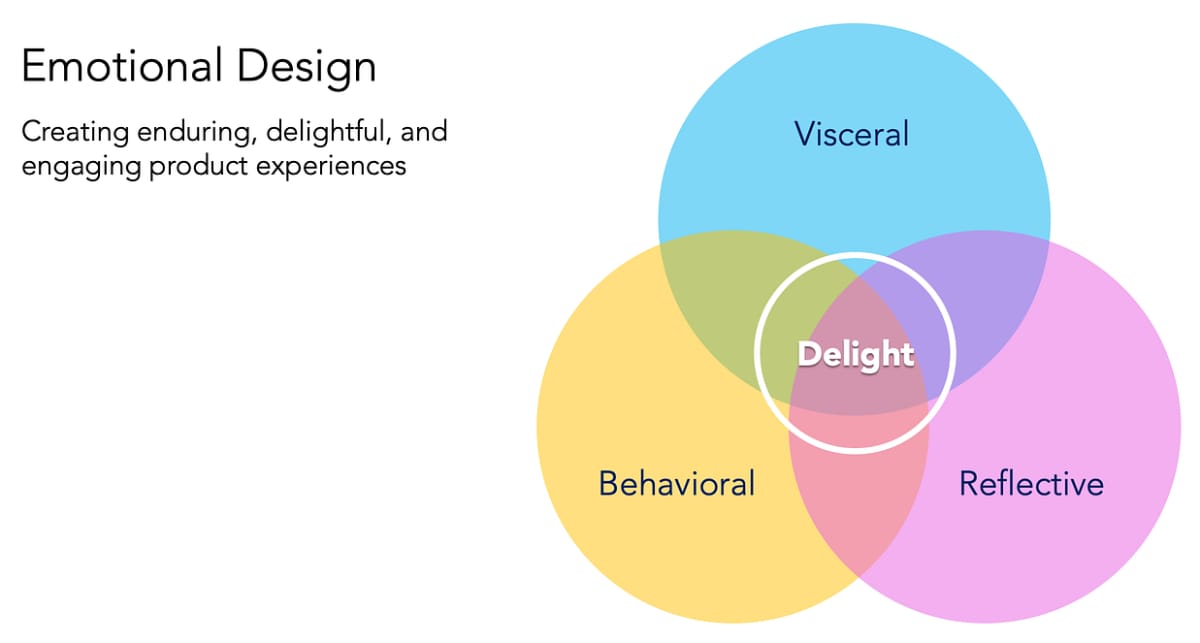
Factor 5) Emotional Design
Emotional Design is a concept that goes beyond the mere functionality and usability of a product to tap into the user's feelings and emotions. This approach, popularized by Donald Norman, suggests that designs should not only be usable but also enjoyable, creating a more profound connection with the user. In the context of web design, Emotional Design is about crafting experiences that elicit positive emotions, thereby enhancing engagement, loyalty, and overall satisfaction with the website.
Understanding Emotional Design
Emotional Design operates on three levels: visceral, behavioral, and reflective. The visceral level relates to the initial impression of a website, its look and feel, and the immediate emotional response it evokes. The behavioral level focuses on the usability and functionality of the site, how satisfying it is to use. Lastly, the reflective level involves the deeper meaning and personal significance the user derives from their interaction with the website.
Incorporating Emotional Design in Web Design
- Visceral Design: This involves making the website aesthetically pleasing through the use of colors, images, typography, and layout. A visually appealing site can generate positive emotions, making users more likely to engage with the content.
- Behavioral Design: Ensuring the website is easy to navigate and interact with reduces user frustration and enhances satisfaction. This includes intuitive navigation, responsive design, and clear calls-to-action.
- Reflective Design: This level of design aims to create a deeper connection with the user by invoking memories, stories, or values. This can be achieved through personalized content, storytelling, and building a community around the brand.
Emotional Triggers in Web Design
Emotional triggers are specific elements that elicit an emotional response from users. These can include:
- Storytelling: Sharing brand stories, customer testimonials, or behind-the-scenes content can create a sense of connection and trust.
- Imagery: High-quality, relatable images can evoke specific emotions, such as happiness, nostalgia, or inspiration.
- Color Psychology: As discussed earlier, colors can influence mood and feelings, making them powerful tools in Emotional Design.
- Personalization: Offering personalized experiences or content shows users that the brand values and understands them, creating loyalty and engagement.
Benefits of Emotional Design
Implementing Emotional Design in web projects can yield significant benefits, including:
- Increased Engagement: Websites that evoke positive emotions are more likely to keep users engaged, leading to longer visit durations and more interactions.
- Enhanced Loyalty: Emotional connections can transform casual users into loyal advocates, increasing word-of-mouth referrals and customer retention.
- Higher Conversion Rates: Positive emotional experiences can motivate users to take desired actions, such as making a purchase or signing up for a newsletter.
Challenges and Considerations
While Emotional Design offers many advantages, it also presents challenges. Designers must understand their target audience deeply to create appropriate emotional triggers without seeming insincere or manipulative. Additionally, emotional design strategies should complement the website's goals and content, ensuring they enhance rather than detract from the user experience.
Emotional Design represents a powerful dimension in web design, transcending traditional metrics of usability and functionality to engage users on a deeper emotional level. By crafting websites that not only meet users' needs but also resonate with their emotions, designers can create more memorable, satisfying, and effective online experiences. As we conclude our exploration of the psychological factors behind great web design, it's clear that understanding and leveraging human psychology can significantly impact the success of web projects, creating digital spaces that users love to visit and interact with.
Final Thoughts
Digging into the highlights the symbiotic relationship between psychology and effective web design. By harnessing the power of Color Psychology, Hick’s Law, Fitts’s Law, the Principle of Proximity, and Emotional Design, web designers can craft experiences that go beyond mere aesthetics. These principles, deeply rooted in understanding human behavior and perception, are essential tools for creating intuitive, engaging, and emotionally resonant websites.
The integration of psychological insights into web design is not just beneficial but necessary for creating spaces that users find meaningful and compelling. This deep dive into the psychological backbone of design reaffirms the idea that at the heart of great web design is a profound respect for the human experience, driving deeper connections between users and digital environments.
If you feel your business's website could use a bit of a design lift, we're here to help. Reach out anytime for a friendly chat and consultation!
Key Takeaways
| Psychological Factor | Key Takeaways |
|---|---|
| 1. Color Psychology | - Colors evoke specific emotions and behaviors. - Use color strategically to influence user perception and actions. |
| 2. Hick’s Law | - Simplify choices to enhance user decision-making. - Reduce cognitive load by minimizing options. |
| 3. Fitts’s Law | - Design with target size and distance in mind for efficiency. - Optimize element placement for user ease. |
| 4. Principle of Proximity | - Group related elements to improve content organization. - Use white space to differentiate between groups. |
| 5. Emotional Design | - Tap into user emotions for deeper engagement. - Employ storytelling, imagery, and personalization. |