5 Ways Minimalist Web Design Boosts Sales


The design of your website is very important for acquiring and retaining customers. One popular approach that is becoming more common is minimalist web design. This design style focuses on simplicity and function by removing extra, unnecessary elements that have no purpose. By concentrating on the essential parts, minimalist design makes a website look better and work better.
But why is minimalist web design so good for increasing sales? The answer is that it improves the user experience. A clean, straightforward design makes it easier for visitors to move around the site and find what they are looking for. This leads to customers being more satisfied and buying more. This article will explain 5 main ways that minimalist web design can help you make more sales: making pages load faster, improving user experience, optimizing for mobile devices, simplifying navigation, and having a clear call-to-action. Understanding these things allows businesses to make good website design choices to increase sales.
Let's start by looking at how minimalist web design increases sales by making pages load faster.
Way 1: Faster Load Times

One of the most significant advantages of minimalist web design is the improvement in website load times. In a world where seconds can mean the difference between retaining a visitor or losing them to a competitor, the speed of your website is critical. Minimalist design directly contributes to faster load times by reducing the complexity of the page.
How Minimalist Design Enhances Load Times
Minimalist web design focuses on the essentials, eliminating unnecessary graphics, widgets, and other elements that can slow down page loading. By using fewer elements, there is less data for browsers to load, which naturally speeds up the process. Moreover, minimalist websites often use more streamlined, efficient coding practices, which further aids in reducing load times.
Impact on User Experience and Sales
Faster load times translate directly into a better user experience. Studies have shown that websites that load within two seconds have significantly lower bounce rates than those that take longer. A lower bounce rate means that more visitors stay on your site, providing more opportunities to convert them into customers.
Furthermore, Google uses page speed as a ranking factor for its search engine results. A faster-loading site is more likely to rank higher, which increases its visibility and drives more organic traffic. This increased traffic can lead to higher sales, as more visitors mean more potential buyers.
Supporting Statistics
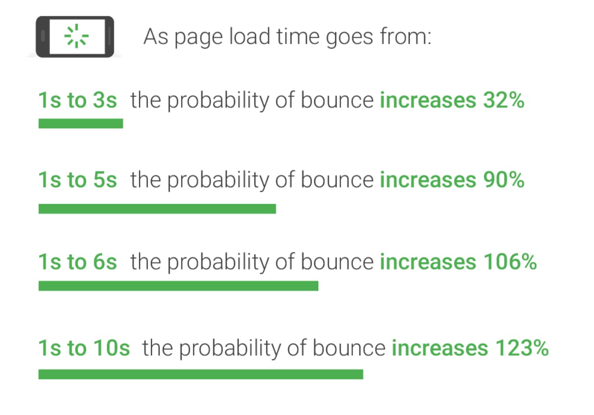
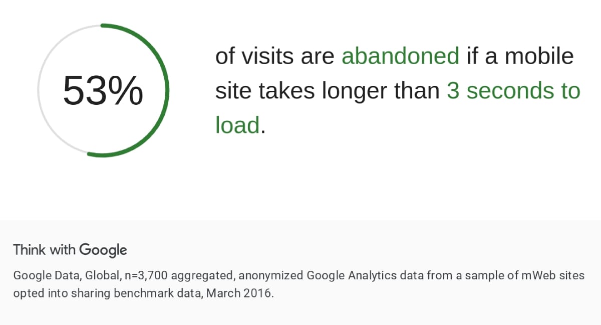
According to Google, 53% of mobile users leave a site that takes longer than three seconds to load. Another study from Akamai found that a 100-millisecond delay in website load time can reduce conversion rates by 7%. These statistics highlight the critical nature of fast load times for maintaining visitor interest and maximizing sales.
By adopting minimalist design principles, businesses can enhance their website's performance, not only making it more appealing to users but also improving their bottom line through increased sales conversions.
Way 2: Enhanced User Experience

A minimalist web design not only accelerates load times, but also significantly enhances the overall user experience (UX). This design philosophy focuses on user-friendliness by stripping away unnecessary details that can distract or confuse visitors. A clean and clear website invites users to engage more deeply with the content, leading to higher satisfaction and potentially increased sales.
Elements of a User-Friendly Interface
The core elements of a user-friendly minimalist interface include clarity, simplicity, and emphasis on the content. By reducing the number of visual elements, minimalist design reduces visual clutter, making it easier for users to focus on what’s important. This includes using ample white space, streamlined navigation menus, and a limited color palette that doesn’t overwhelm the senses.

Improving Satisfaction and Retention
A simplified interface facilitates quicker understanding and navigation, allowing users to find what they need without hassle. This ease of use leads to a better user experience, which is directly linked to customer satisfaction and retention. Happy users are more likely to return to a website and recommend it to others, increasing the customer base and boosting sales organically.
Examples of Successful Minimalist Web Design
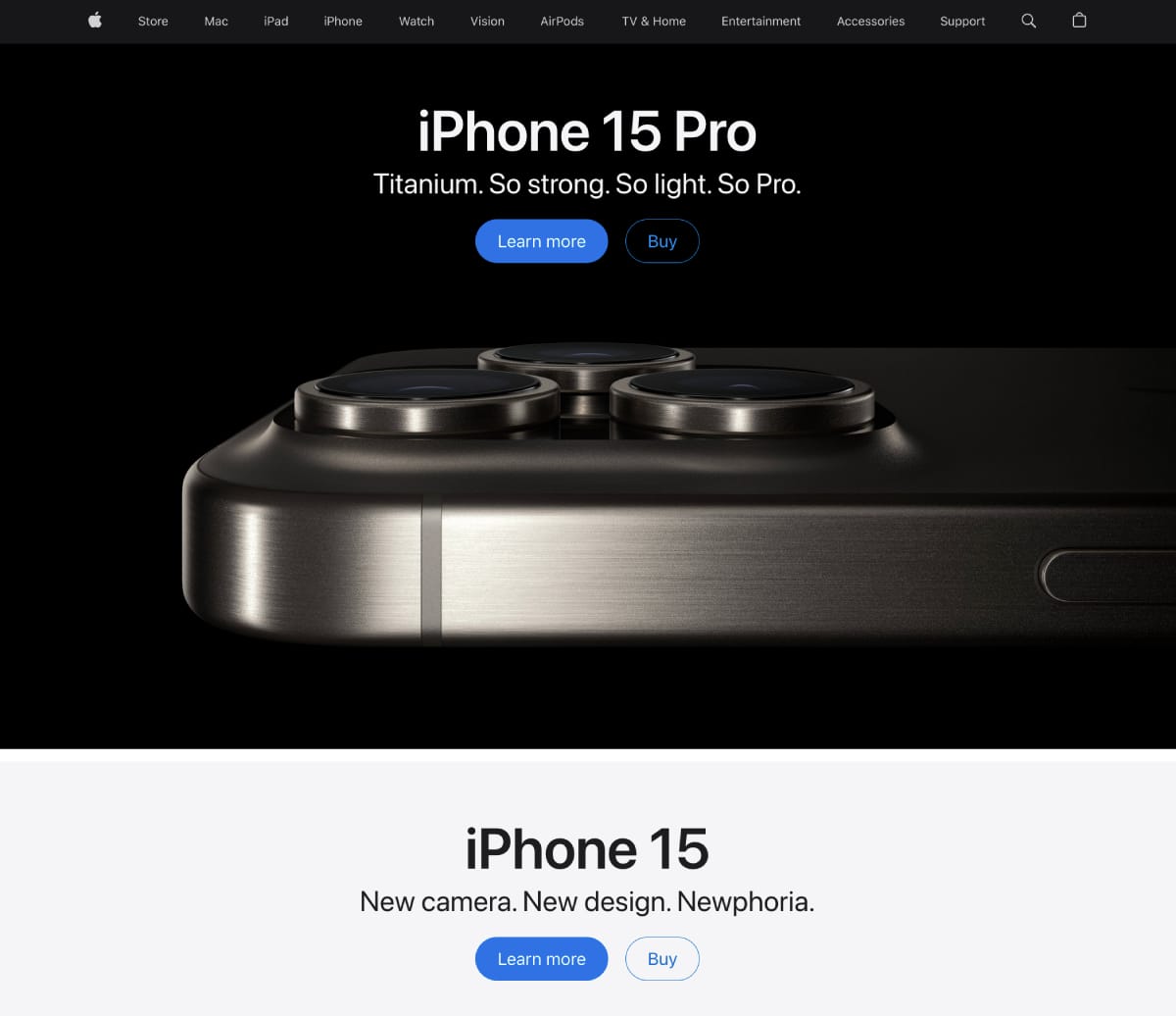
Several high-profile companies have successfully implemented minimalist design principles to enhance user experience and increase sales. For instance, Apple’s website is a prime example of minimalist design that focuses on product visuals and essential information, leading to a highly intuitive user interface. This design approach not only reflects their brand ethos of simplicity and functionality, but also effectively showcases their products, encouraging purchases.
By improving the user experience through minimalist design, businesses can create a welcoming environment that facilitates sales. Engaged users are more likely to convert into customers, reinforcing the direct link between good design and sales performance.
Way 3: Improved Mobile Experience

Mobile responsiveness is not just a feature but a necessity. Minimalist web design naturally lends itself to creating better mobile experiences, which is essential for boosting sales, considering the increasing amount of traffic coming from mobile devices.
Importance of Mobile Optimization
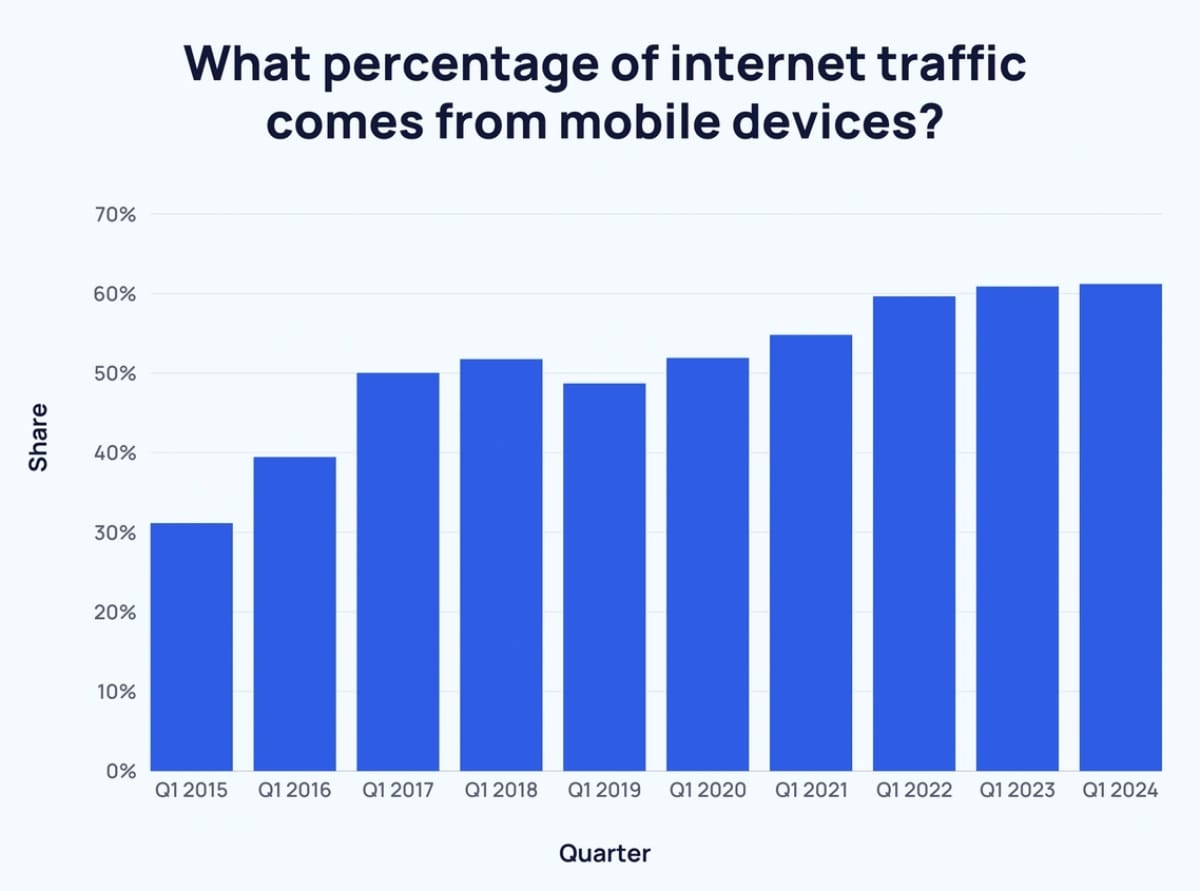
With over half of all global web traffic coming from mobile devices, having a website that is optimized for mobile is crucial. A mobile-optimized site ensures that users on smartphones and tablets have a seamless experience, which matches the functionality and aesthetic of its desktop counterpart. Minimalist design, with its emphasis on simplicity and efficiency, aligns perfectly with the requirements for mobile-friendly web pages.
How Minimalist Design Complements Mobile Layouts
Minimalist web design inherently avoids excessive use of heavy images and complex layouts, which can be particularly problematic on mobile devices. The clean lines and uncluttered aesthetics not only load faster, but also scale better on smaller screens. Simplified navigation and larger, legible fonts improve usability, crucial for mobile users who navigate on smaller displays.
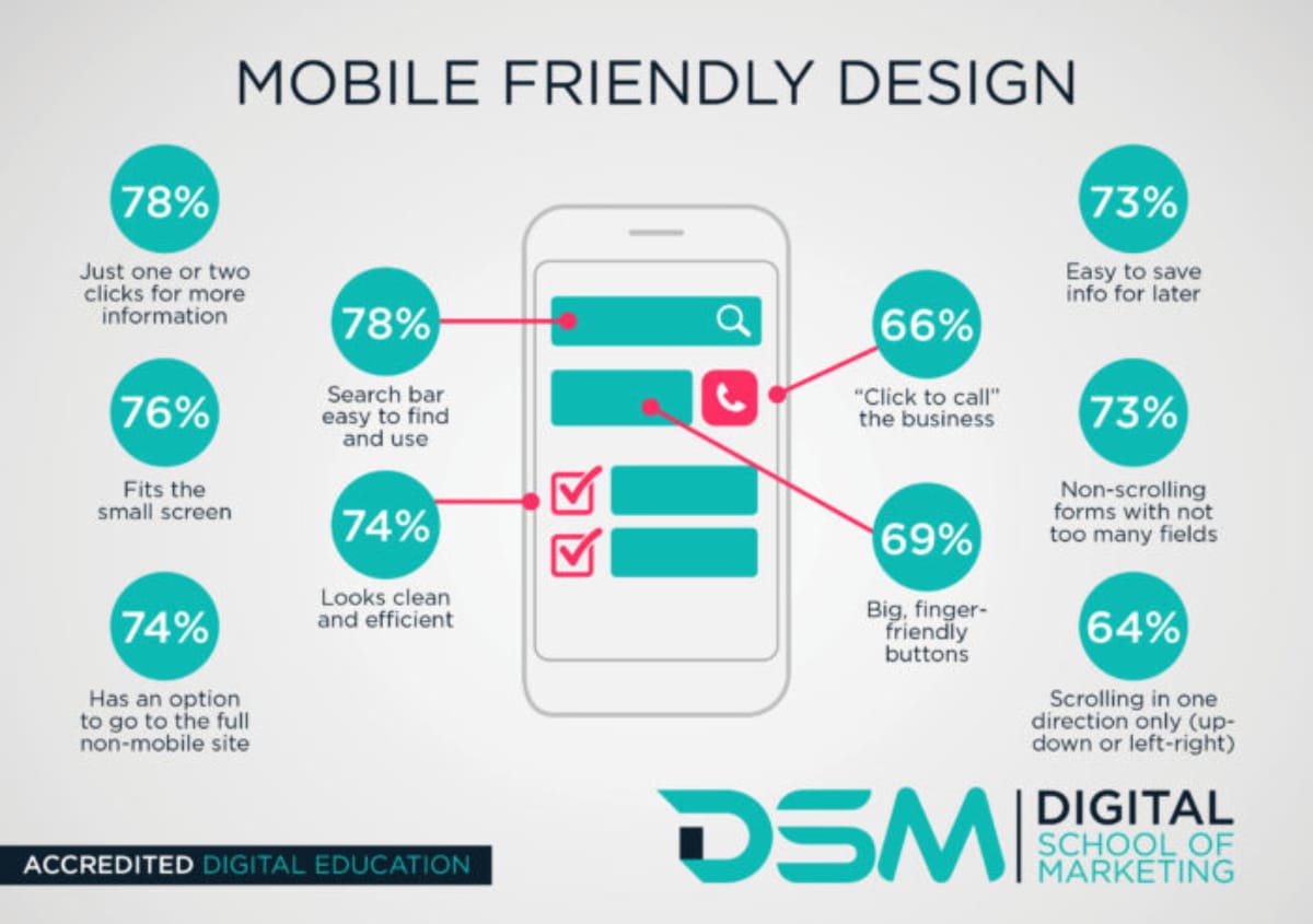
Effect on Sales When Optimized for Mobile Devices
Mobile optimization directly impacts sales. For instance, according to a report from Adobe, companies with mobile-optimized sites triple their chances of increasing mobile conversion rates to 5% or above. A minimalist design facilitates this by making the mobile site easy to use, encouraging longer session times and more interactions, which often lead to increased conversions and sales.
Case Studies Highlighting Mobile Optimization Success
Companies like Squarespace and Everlane use minimalist design principles to create visually appealing and highly functional mobile sites. Their focus on clean aesthetics and usability showcases how effective minimalist design can be in enhancing mobile user experience and boosting sales.

As more people use their mobile devices for shopping and browsing, optimizing a website for these users with a minimalist approach can significantly enhance sales performance.
Way 4: Easier Navigation
One of the pillars of minimalist web design is its ability to simplify navigation, making it straightforward for users to find what they are looking for without unnecessary complications. This ease of navigation not only enhances user experience, but also significantly increases the likelihood of converting visitors into customers.
Principles of Minimalist Navigation
Minimalist web design achieves easier navigation through a few key principles:
- Limited Menu Options: By reducing the number of choices available in the navigation menu, minimalist design helps to prevent users from feeling overwhelmed. This focus helps users make decisions more quickly and confidently.
- Clear Visual Hierarchy: Using clear headings, subheadings, and a logical layout ensures that users can follow the structure of the site with minimal effort. This logical progression makes it easier for visitors to browse and locate the information or products they need.
- Intuitive Design: The overall design is intuitive, meaning that it aligns with the user's expectations based on common web practices, such as placing the menu in easily accessible locations and using familiar symbols.
Relationship Between Navigation and Sales Conversions
Effective navigation is directly linked to improved sales conversions. A site that is easy to navigate reduces frustration and allows users to progress smoothly from initial interest to purchase. This seamless flow is critical in minimizing bounce rates and maximizing the chances of a sale. According to a study by Forrester Research, a well-designed user interface could raise a website's conversion rate by up to 200%. This statistic underscores the significant impact that intuitive navigation can have on a business's bottom line.
Real-World Examples of Successful Minimalist Navigation
Many leading e-commerce sites employ minimalist navigation principles to enhance user experience and boost sales. For example, the fashion retailer Zara uses a clean, straightforward layout with high-contrast typography and generous white space, which makes it easy for customers to navigate their extensive catalog. This approach not only reflects their modern brand identity but also facilitates quick purchasing decisions.

The correlation between simplified navigation and increased sales is clear. By making it easier for customers to find what they are looking for, companies can enhance user satisfaction and drive up sales figures.
Way 5: Focused Call to Action

A focused call to action (CTA) is a crucial element of any successful sales strategy, and minimalist web design can significantly enhance its effectiveness. By simplifying the overall design, minimalist web design ensures that the CTA stands out as a central focus, making it clear and compelling to users.
Role of a Call to Action in Sales Conversions
The CTA is the gateway through which a website visitor becomes a customer. It is the instruction or encouragement that prompts a user to take the next step, whether that's subscribing to a newsletter, requesting more information, or making a purchase. The clarity and visibility of the CTA are paramount in this conversion process. A well-defined CTA in a minimalist design reduces distractions and focuses the user's attention on this essential element.
How Minimalist Design Highlights Calls to Action
Minimalist design principles such as ample white space, limited color palettes, and straightforward typography help make the CTA stand out. By eliminating unnecessary elements, these designs ensure that the CTA is the focal point of the page. For example, a bright button on a clean, white background with a concise message ("Buy Now", "Learn More", "Sign Up") can catch the eye and encourage action more effectively than one lost in a busy, cluttered page.
Impact on Sales When Calls to Action are Prominent and Clear
When CTAs are clear and prominently displayed, they can significantly increase the likelihood of a sale. Research indicates that users often decide whether to engage with a website within seconds; thus, a prominent CTA can effectively capture this fleeting attention and convert it into action. For instance, Dropbox increased its conversion rate by over 10% simply by clarifying its CTA and making it more visible against a minimalist backdrop.

This approach has been effectively utilized by numerous companies. For example, Netflix uses a bold, simple CTA on its landing page that stands out against a dark, minimal background, making it easy for new visitors to understand the action expected of them.

By effectively leveraging a focused CTA within a minimalist design, businesses can guide users toward desired actions, enhancing the chances of conversion and boosting sales.
Final Thoughts
Minimalist web design is more than just about looks - it is a smart way to make your website work better and increase sales. By making pages load faster, improving how easy the site is to use, working well on mobile devices, making it simpler to navigate, and having clear calls-to-action, minimalist design can turn your website into something more efficient, user-friendly, and profitable.
As the digital world keeps changing, businesses that use minimalist web design will stay ahead when it comes to usability, looks, getting more conversions, and keeping customers happy. Whether you are building a new website or thinking about redesigning your current one, considering these five aspects of minimalist design can really improve how engaged users are and how many sales you make.
Seeking a minimalist website redesign? Reach out to us.
Key Takeaways
| Minimalist Design | Key Takeaways | Example |
|---|---|---|
| 1. Faster Load Times | Simplified elements reduce data load, speeding up website responsiveness. | Google reports 53% mobile users leave if load >3s. |
| 2. Enhanced User Experience | Clarity and simplicity improve satisfaction and retention. | Apple's intuitive, minimal design enhances usability. |
| 3. Improved Mobile Experience | Minimalist design complements mobile layouts, enhancing usability. | Mobile-optimized sites triple conversion rates. |
| 4. Easier Navigation | Simplified navigation aids in finding information quickly and easily. | Zara's clean layout helps users navigate their catalog. |
| 5. Focused Call to Action | Clear CTAs direct user attention and increase conversion likelihood. | Netflix uses a bold CTA on a minimal background. |